UI ReDesign
App/Fourm
5 min read
Redefining Convenience and Care: Goodlii Transforms Salon Booking Into a Faster, Smoother, and More Trustworthy Experience With a User-Centric Redesign That Reduces Friction and Boosts Confidence at Every Step.
Duration
2022 (3 months)
Project Role
Interaction Designer
METHODOLOGy
UX Audit, Stakeholder Interviews, User Flows, Journey Mapping, Affinity Mapping, Persona Building, Wireframing, Prototyping, High-Fidelity Design, Usability Testing
Tools
Figma, Adobe After Effects, Adobe Photoshop, FigJam, ChatGPT, Slack, Zoom, Google Workspace
The Challenge
Goodlii, a salon booking platform, was meant to make self-care simple, but users found the experience confusing and cluttered. Appointments took too long to book, notifications often failed, and payments felt frustratingly slow. The app didn’t live up to the calm, effortless experience it promised.
We set out to redesign the entire journey, not just the interface, making it smoother, faster, and more trustworthy for both customers and salons.


Understanding the Pain Points
To uncover why users were dropping off mid-booking, we conducted UX audits and interviews with frequent users and salon owners.

Here’s what we learned:
The booking flow was too long, with unnecessary steps and unclear progress indicators.
Notifications failed, leading to missed appointments.
Payment integration was slow, creating uncertainty at checkout.
Limited service options frustrated users seeking specific treatments.
Outdated design lowered engagement and trust.
“I’d rather just call the salon, at least I know someone will confirm.” - User during interview
Framing the Opportunity
We realized that Goodlii didn’t just need better visuals — it needed to rebuild trust through clarity and flow.
So we asked:
These questions guided every decision in our redesign process.
We mapped key personas:
The Regular User: someone who books monthly and wants quick access to favorites.
The New User: exploring options, comparing salons, needs confidence in reviews and pricing.
The Salon Owner: needs an easy-to-manage booking system and reliable scheduling notifications.
Each persona shaped different aspects of the UX, flow, feedback, and visual communication.
Persona 1: The Regular User
Goals:
Rebook her usual stylist in under a minute
See real-time slot availability
Quickly check pricing before confirming
Receive timely reminders so she doesn’t forget appointments
Pain Points:
Too many steps to rebook the same service
Hard to view available time slots at a glance
Receives inconsistent notifications from other apps
Gets frustrated when stylists update prices without clarity
Motivations:
Convenience > exploration
Trust and reliability in service providers
Smooth, repeatable booking experience
Wants a predictable, no-surprise process
Persona 2: The New User
Goals:
Discover trustworthy salons with good reviews
Compare services, ratings, and prices easily
Understand what’s included in each service
Have a seamless onboarding and payment experience
Pain Points:
Gets overwhelmed by too many options
Fake reviews make it hard to trust providers
Doesn’t understand hidden fees or unclear pricing
Struggles when booking flow feels lengthy
Motivations:
Wants confidence before making a choice
Prefers apps that guide him step-by-step
Transparency and clarity build trust
Searches for real user photos and genuine reviews
Persona 3: The Salon Owner
Goals:
Manage bookings without back-and-forth calls
See daily schedule clearly
Update prices, services, and available slots easily
Send system-generated confirmations & reminders
Pain Points:
Manual booking causes double-bookings
Staff forget to update schedule changes
Hard to manage different platforms (Instagram, WhatsApp, calls)
No centralized place for managing services, pricing, customers
Motivations:
Wants fewer operational headaches
Prefers tools that require zero technical skill
Wants a quick snapshot of bookings & cancellations
Needs automation for reminders & confirmations
With our personas defined and their needs clearly mapped, we shifted into the design phase with a focused perspective. Each decision, from layout to interactions, was guided by the motivations, behaviors, and pain points we uncovered.
Design Strategy
We set out three design principles:
Clarity over clutter — simplify flows and copy.
Transparency builds trust — show prices, times, and confirmation upfront.
Familiar motion patterns — use microinteractions to reassure users.
The redesign focused on a minimal, fresh visual language:
Softer color palette for a clean, modern look.
Refined typography and grid for readability.
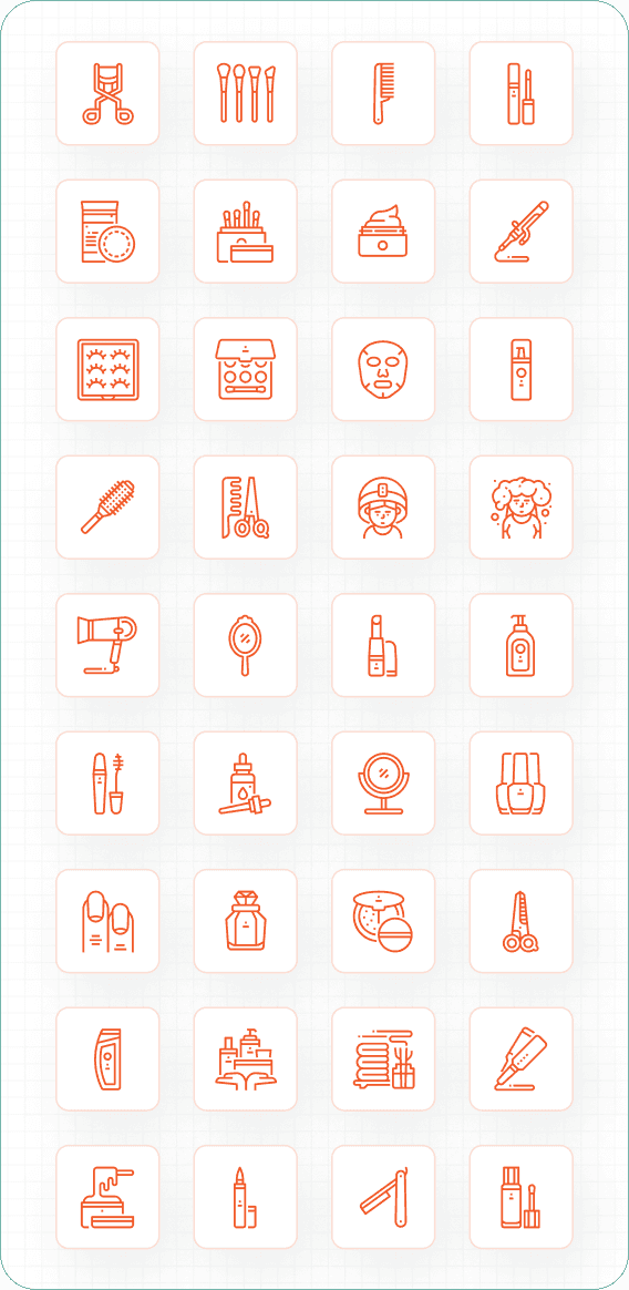
Simplified icon system and intuitive visual hierarchy.


Prototype & Testing
We built interactive prototypes to test how users navigated the new flow.
Testing revealed a 38% faster completion time for bookings and higher trust ratings during checkout.
Impact & Reflection
This project taught me that design isn’t just about speed — it’s about emotion.
A smoother booking flow not only saves time but also builds trust and calm — exactly what a salon experience should feel like.
“When technology feels invisible, users feel in control.”


